Teaching a Brand to Build Itself
Chameleon Collective's brand lived in a PDF. We rebuilt it as a system the whole collective can execute from — so the brand comes out right on the first pass instead of the third.
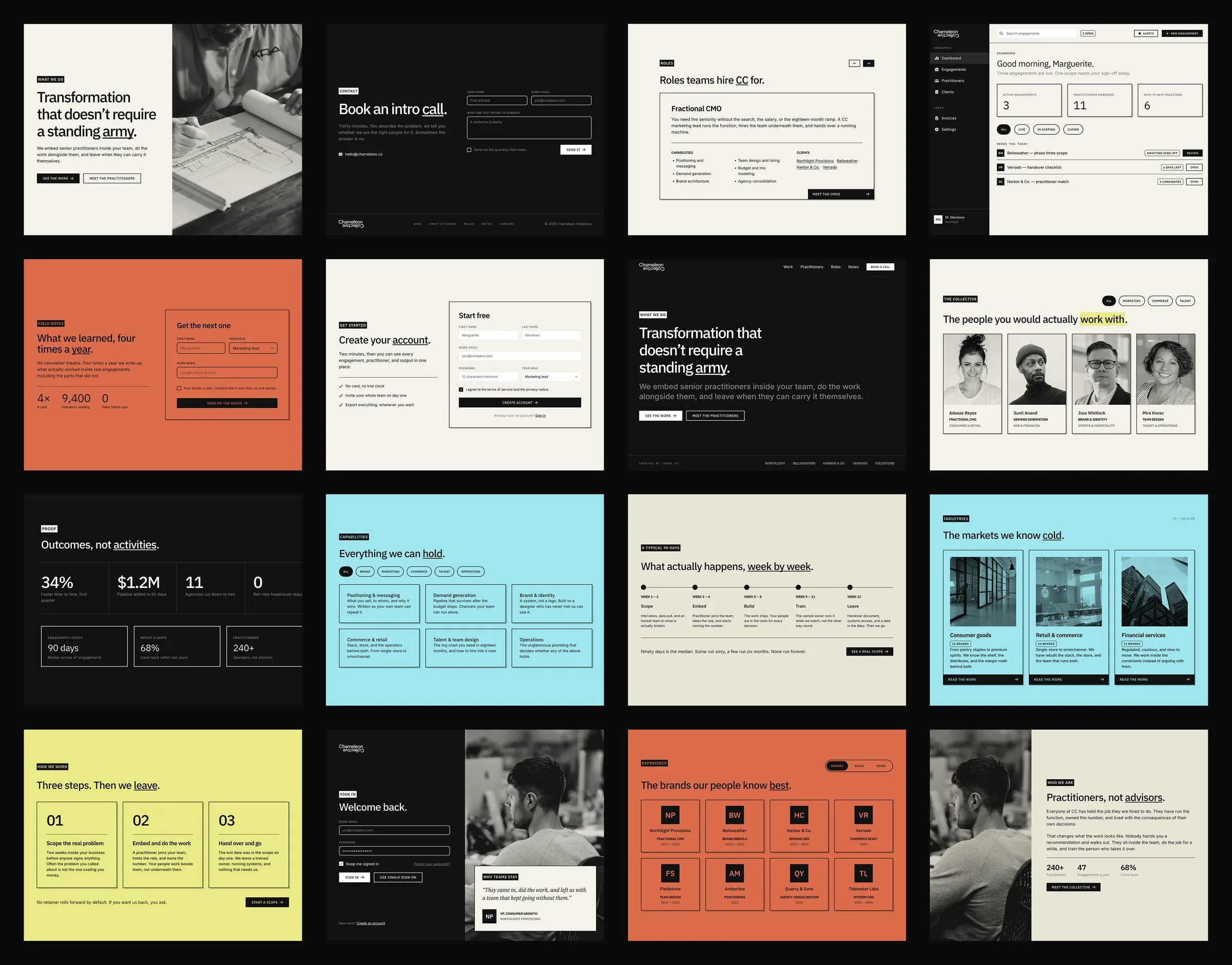
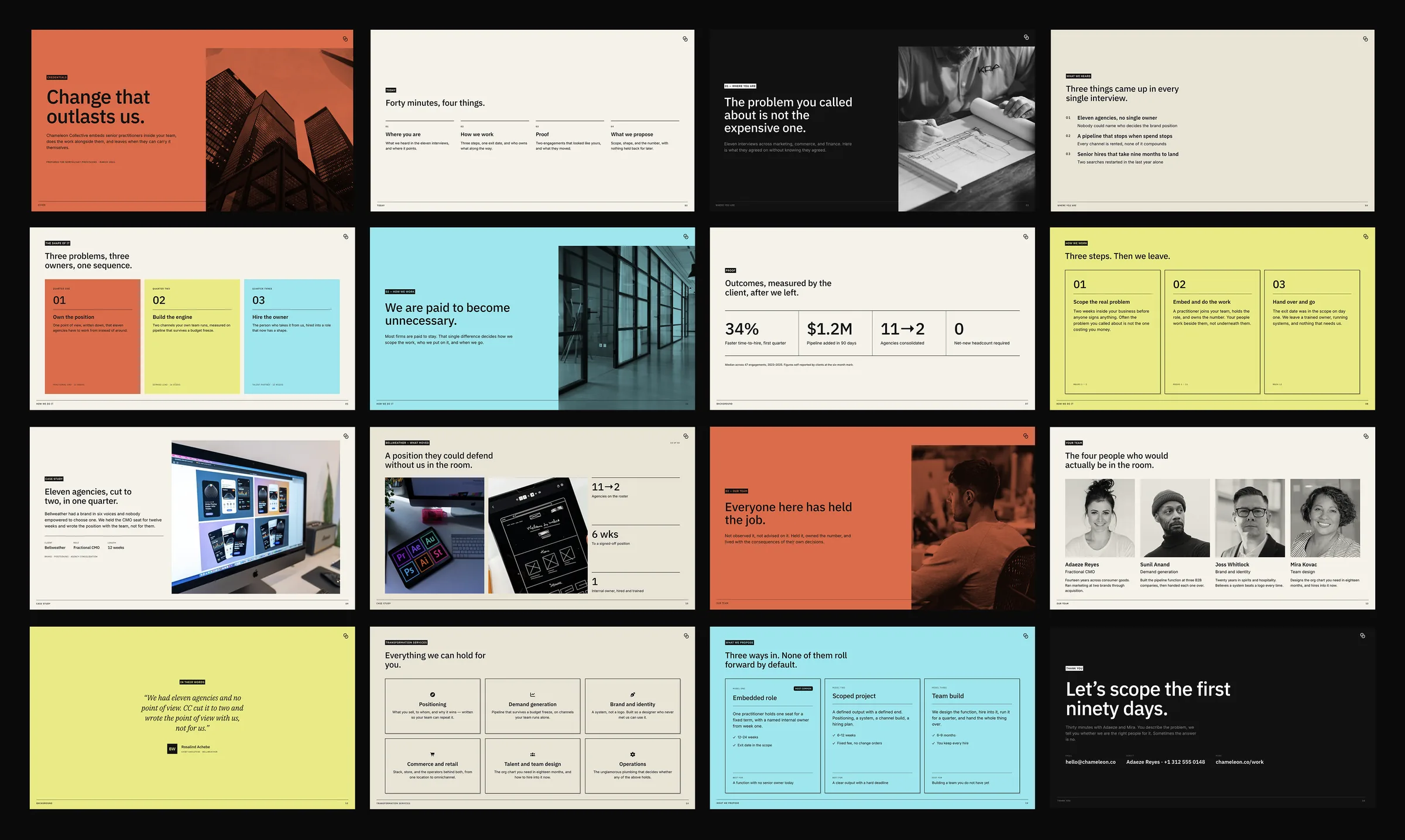
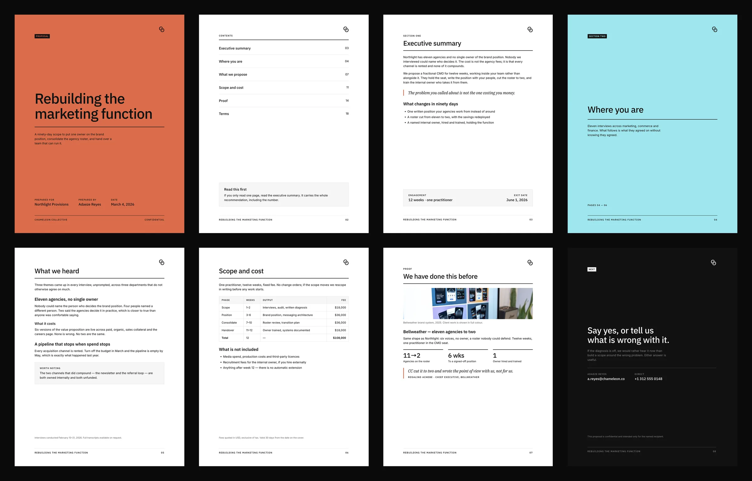
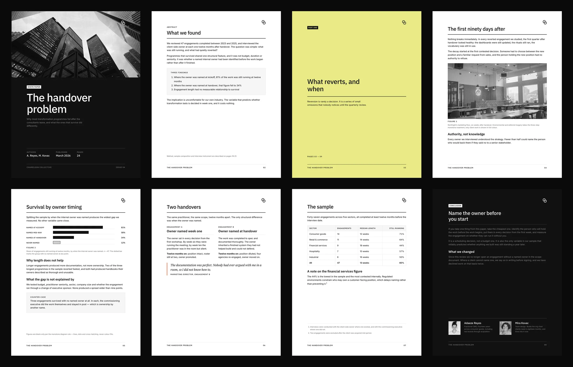
Fig. 01 — What the Brand DNA holds, and what it produces
Chameleon Collective is a network of independent practitioners who embed with clients and then hand off. That model is the entire value proposition. It is also the hardest possible condition for brand consistency.
Work gets made by many hands, in many tools, usually with no designer present. A pitch deck, a proposal, a product interface, and a social post can each land close to the brand without being it — a slightly-off orange, a rounded corner, a headline that could belong to anyone. None of that is a failure of care. It is the arithmetic of a distributed model: the more hands that make the work, the less any single standard survives contact with it.
The brand had documentation. Most brands do. What it did not have was documentation that could execute. A guideline describes what right looks like. It cannot make right happen on a Tuesday afternoon, in a proposal nobody thought to show the brand team.
Most brand guidelines die in a PDF. They describe the brand beautifully, then sit in a folder while the work drifts.
Two connected pieces, built so that everything else defers to them.
The core library
Design tokens, React components, and Storybook stories. Every visual decision resolves to a named token — color, spacing, radius, shadow, type. If a value is not a token, it does not ship. The rules stop being described and start being enforced.
The Brand DNA
A specification written once, in a structure a person and a machine can both read. Not prose about the brand — the brand itself, expressed as rules. Hard constraints that never bend. A complete token vocabulary in which each token carries its meaning, not only its value. A voice guide with an actual banned-words list. And a structure — set out below — that the whole thing files against.
The installable capability
The whole specification packaged so that any contributor — or any AI agent working on the brand's behalf — loads the whole brand in one step. Once loaded, it reads the constraints, the tokens, and the voice on every task, then pulls in the surface and the patterns the job requires. Ask it for a credentials deck, a proposal, a product screen, a landing page, or a line of copy, and it builds from the same brain a senior designer would.
The agent is one component of the system, not the system. The tokens, the component library, the surface guides, and the governance rule are what make its output trustworthy — the same argument we make at length in The Case for Brand Systems.
The shape is portable. What goes inside it is yours.
Written this way, any brand resolves into the same three tiers. What changes from one company to the next is the contents, not the structure.
What never bends, whatever is being made. The constraints, the token vocabulary, and the voice — read before anything else, so the answer to “what does this brand do here?” is never reconstructed from memory.
A slide is not a screen, and a proposal is not an ad. Each medium gets its own guide, so the brand doesn't quietly get flattened into whichever surface the person making it happens to know best. This is the tier most brand guides skip — and the reason a company's deck and its product so often look like two different businesses.
The recurring decisions, each settled once and written down. Nobody loads all of them: a landing page pulls composition and colour, a form pulls inputs and focus states, a deck pulls layout and imagery. The library grows as the brand meets new problems.
Four things separate a specification that gets used from one that gets ignored.
Tokens carry roles, not values
A token named for its job survives a rebrand. One named for its colour does not. Every value in the vocabulary is tagged with what it is for — which is what lets someone who has never met the brand team make the right call.
A short list you can hold in your head
The full specification is exhaustive by design. Sitting on top of it is a single page of non-negotiables — the handful of rules that define the look. The long version settles arguments. The short version prevents them.
Nothing gets invented
Where the specification is silent, the instruction is to stop and ask — never to fill the gap with something plausible. Almost all brand drift starts as a reasonable-looking invention that nobody thought to flag.
Every deliverable gets checked
A pre-delivery checklist anyone can run without a designer present: type roles, shape rules, colour, tokens, contrast, and copy against the banned-words list. Judgment is what goes into the system; the checklist is how it comes back out.
The most consequential part of this engagement was not a feature.
It was a governance decision.
Partway through, the drift came back. A color called “charcoal” appeared where it had no business being. Buttons went soft at the corners. The cause was instructive: the system had been reconciled against the implementation code rather than the brand's intent — and the code had quietly drifted from where the brand was going. Compounding it, two copies of the specification existed in different places, and the older one was being read as the reference.
The Brand DNA is the source of truth. If the code disagrees, the code is what is wrong.
We rebuilt from the authoritative specification, synced the copies so they cannot diverge again, and left an explicit instruction for anyone — or anything — working on it later: do not correct the brand against the implementation.
It is a small decision, and it is the one that holds the rest up.
A brand system is only as good as its answer to a single question: which version wins?
The brand is right by default, not by vigilance.
Figures are counts of the delivered system. No performance metrics are claimed.
A brand system earns its keep by staying alive. The specification is versioned, governed, and built to take new patterns as the brand grows.
The current prototype is a chain drawn from the mark itself — the two interlocking C's extended into a woven chain that can meander through a layout. It introduces curves as a counterpoint to the sharp corners, and makes the idea of connection literal. It gets built, it gets lived with, and if it earns its place, it becomes part of the language.